Looking at Improving your Website?

Looking at Improving your Website?

10 13 Tips to Help You be Seen as More Professional.

As a website design company with a focus on marketing and brand perception, we often get asked to take a look at websites and see what can be done to help make them ‘more professional’. Over the years we have compiled a list of things that are very common and that can definitely help bring a website to the ’next level’. We regularly audit our list, bringing things up to date and making sure it is current and usually find that the basic changes that should be done are consistent. Before we get too far in we thought it a good idea to note that a website needs to be based on a solid business approach. If you cannot tell a prospective client what do you simply and concisely, your website will likely not do so either. Starting with a solid foundation is step one. Here are our 12 other tips to consider for your website.

1. Logo!

Do you have one? Your company or product logo is your identity. Be sure that you have a professionally designed logo that is easy to view and, if it contains text, easy to read. Something that’s not too busy, visually explains what you do and, if it is a text logo, is unique or designed enough to look like more than just plain text. Professionalism is key to good business interactions and success. Even if you are a non-profit, people connect with professionalism as, to them, it states organized, trustworthy and reliable.

2. Cost vs. Savings.

With ‘free’ website builders and company’s offering amazing deals on building your website it is too easy to get caught up with the special that is presented to you. As a business owner I am also careful as to how I spend my money. That said, there are always going to be deals in any market. So, does the saying “You get what you pay for.” truly come into play? Without hesitation we say, yes. Just because you can does not mean you should. A true expert in their field will not only build you a great site but understand why things are done as they are and build a site that works for you. Cheaper sites are usually filled with errors (either noticeable or behind the scenes) that can hurt your site performance, visitor conversion and potentially leave your site at risk and open to hackers. Experts are worth the price.

3. Know who the site is for.

A website is not something that should be built with your own personal desires and likes in mind. A website should be built to understand your target market… your customers… and how they interact online. Don’t make the mistake of thinking that just because you like things a certain way that your clients think the same. They usually do not. We have had clients claim that their clients don’t go to sites on their phones… probably because they don’t… only to ask people within the same industry how they research potential suppliers and discover that a majority will go to their online site on the way to or from their initial meeting. This is only one example but I think you get the idea. Your clients do not have the same online habits and likes that you do. Do not think you know what they want as an online experience without at least asking them.

4. Your site isn’t responsive? Seriously??
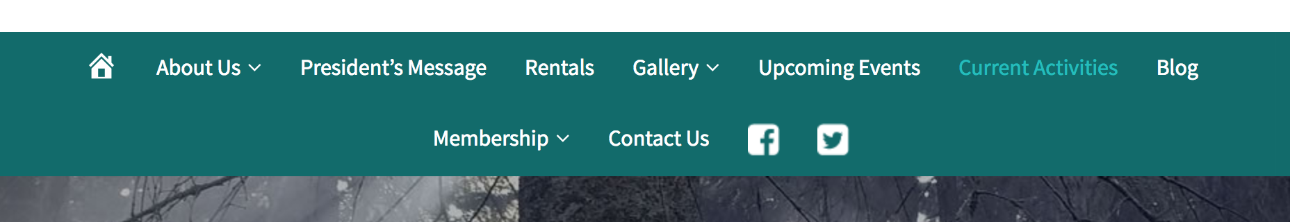
Back to #2’s example. The world is mobile and your site needs to work well in the mobile world. We’ll be blunt here. Get your website mobile friendly and displaying nicely on mobile devices or lose clients. It’s really as simple as that.

5. Easy to use.

A website should always be appealing to your target audience. Being appealing online means that information is easy to find, it’s not too much information when it is found and visitors need to enjoy the experience.

6. Consistent Branding. 

This means that your site should be visually professional and consistent with your product or company branding. When you travel around the world you are almost certain to find a McDonalds wherever you travel. That McDonalds is often visited by tourists for one main reason… people know what to expect… the experience is familiar and therefore comfortable…. your brand should be the same. From a clients first interaction with you, to your business card, to your brochure, to your website and all the way through the process a client should feel the continuity from each stage of interaction. On your website the should see and feel the same as when meeting you in person. That comfortable feeling will most often result in trust and client conversion.

7. Organized / Looks good.

This can mean and cover many things but for this article we will deal with site navigation. Make sure your site navigation does not spread into more than one line. We know that when we are looking at a company to use their services and their website has navigation that spreads into two lines, we immediately feel as though it is disorganized. Then we think.. well, if the site is disorganized we can only imagine that they are a disorganized company as well. That doubt takes me away to another competitors site and we usually give our business to the company we feel safest dealing with.

8. Security.

SSL certificates are becoming more and more a must for any website that collects ANY information, not just for site selling online. If your site has a form to be filled out, even just to contact your company, it shares information so security is needed. Yes it will cost you a little money and time but it’s worth your clients feeling safe on your site.

9A. Keep it Simple.

Your home page should be simple and easy to view. It is the basic introduction to your company for those who arrive online. It should point out quickly what you do and tell the visitor what they can do as a next step. Do they click for more information on the area of their interest? Do they contact you via a simple contact form? Do they sign up for your newsletter? You need to lead your visitors to what is next and make it easy to get there.

9B.

When writing this tip we realized that simplicity is also tied to how the overall page looks. Try to keep lots of space around text and keep it easy to read. Darker (not fully black) text on a white background it the easiest to read. This also gives a very clean look and feel to site visitors. If you want to use coloured backgrounds be sure to make them consistent throughout your site and DO NOT add images with a different colour background to these pages. This looks simply unprofessional. Try using transparent .png images as they can work on any colour background.  Also, make sure that images make sense. If your visitors don’t know what the images are about they will get confused and leave. Keep It Simple.

10. Make Easy to Read content.

Good contrast as noted in #8B is important. Also be sure your fonts are larger enough to read but not too large. 12-14 Point text is fairly standard size for fonts. Try using sans serif fonts instead of serifed fonts. Sans serif fonts are easier to read and are what people are familiar with online.

11. Watch your layouts.

Don’t keep all levels of your website pages the same. Website visitors tend to view sites by scanning back and forth. They do so as scanning rows. Your website should be built with this in mind so that visitors, again, feel comfortable as they go through your site. Think of your site as a collection of straight rows and columns and keep them organized accordingly. There are several studies available online on how people view websites. You may want to read up on some. Here is a great one with visuals. <https://www.crazyegg.com/blog/lessons-eye-tracking-studies/>

12. Speaking of visuals.

Be sure that you do not overdo your images and present them in an organized manor. Sure images are needed but how many, at what size and where is the question. Too big and it can be overwhelming to viewers. Too small doesn’t break up the text areas to make the space visually interesting. Also be sure that your images are not too large when it comes to file size. Overly large images will take longer to load and can cause visitors to leave before really visiting your site.

13. SEO…..

Okay – here’s a semi-controversial statement. We believe that unless your company relies wholly on sales directly from your website ONLY then do not focus solely on your website SEO. Now let us explain. Firstly, there are MANY ways to market your business and build solid relationships with your clients. If you are not solely reliant on website sales to succeed then make sure you are using other means of marketing and reaching your audience. They will still go to your site for the information they need and want to obtain but how they get there can easily be from means other than a search. There is a semi-fine line between SEO focus and good website presentation. A website that has focussed solely on SEO is likely not to be attractive to visitors when they get there. What use is spending all that time and money getting people to your site if they leave once there as it’s not appealing or easy to use?

greg T

Owner and Creative Director | The Image Stop ltd.

Greg has been in marketing and advertising for over 30 years, 23 of the last  years as owner of The Image Stop ltd. His background and schooling in this area coupled with his studies in human psychology have created repeated successes for both his company and clients alike. For fun Greg practises and performs as a magician / impersonator and mentalist.

Contact iS

Contact us anytime. We appreciate meeting our clients and discussing their Design and Marketing ideas. Please use our Online Booking button in our navigation menu or send us a note here.

Office: 403.630.3409


Mailing Address: 47 Cedarbrook Close SW Calgary, Alberta T2W 5B8

Business Hours: 8am – 4:30 pm, Monday to Friday (MST)